Tuesday, April 28, 2009

Jade Thomas - Paula Scher


Paula Scher


Paula Scher was born in 1948 in Washington D.C. She is a well known graphic designer and artist.
in the 1970's she designed album covers for CBS records and other labels before moving into a more artistic direction for magazines. She then went on to form her own design firm, "Koppel & Scher".

Paula scher has been very successful in her career, she has received numerous rewards including; The Chrysler Design Award, A gold medal from the American institute of graphic arts (AIGA) which is the highest possible recognition of her distinguished achievements and contributions to the field, some of her art works are being kept in museum of modern art in the permanent collection and also has received four Grammy Award nominations for her album covers.

I chose to focus on paula scher because she doesn't like to continue and continue to refine idea's, she prefers to simply do big bold strokes that often occur quickly. Which is how i like to work, I find refining to be teadiouse and very time consuming. For me it's the hardest part of designing.

Paula Scher is well known for her large scale opinionated maps. Her paintings are often intricate and expressive.


The above is one of her large detailed maps.


This album cover designed by Paula Scher was realesed in 1981 for an electronic band.


Bibliography: (and for further information see the following websites.)


Christopher Rowland: Analysis/Critique of James Victore's work and how it relates to me.

James Victore

James Victore I can relate.

One thing that I find to be a great aspect is that he is for design as social commentary and to display a message more than just advertising a brand name or something petty like that.

He has states that he wishes not to be labeled as a designer. He teaches graphic design which I also find I can relate to, as one day I wish to be able to teach my skills and ideals to a younger generation of artists.

He believes that political social commentary and the cultural works is what graphic design is about and is when it is at its best.

I agree.


James Victore also deals in commentary on racism and prejudice. The cultural works are some of his most famous.


Social Commentary...

NOT used to sell socks.

I enjoy James Victore's style.

References -

Portfolio Center | Interviews | James Victore
JAMES VICTORE INC.
YouTube - James Victore Interview
Apple - Pro - Insights and Ideas / Color - James Victore: What I Like
Q&A: James Victore

Post 6: James Victore - Candy


JAMES VICTORE

I choose James Victore because of the controversy he causes through his work, I think it takes great courage to speak out about major issues in society, and to put a different light on it to make us think about the issues he brings up. 

James Victore is a self-taught independent artist and designer, his clients include Moet & Chandon, Aveda, Apple. Currently, James is designing a limited edition plate for Design Within Reach, as well as a line of hand-painted surfboards.  His designs are in the permanent collections of the Palais du Louvre and the Library of Congress. Recently a book of his work was published in China. He teaches graphic design at The School of Visual Arts in New York City.

One of his inspirations are, Why has graphic design become so damn boring? James creates controversy whenever he speaks, his presentation will not be for the faint of heart.  He mentions in a 2006 interview in Step Inside Magazine, “Swearing for me is like punctuation.” But his work and ideas are as inspiring as they are uncompromising. James transcends the easy classification of designer. He is an unrepentant communicator and activist. James clarifies the idea of personal vision and perspective, and reminds us of the importance of communication in a pluralistic society.


One of Victore’s early works  “Celebrate Columbus” poster, a poster for Columbus Day, 1992, casting Christopher Columbus in a decidedly negative light. He hung 5,000 posters around Washington, D.C. and then watched people try to understand them. His biggest thrill came when the police started scraping his posters off the wall. This thrill of creating such a powerful message by working first to please himself and not for a client led him to continue his work.


Victore’s 1993 “Racism” poster was a reaction to increasing racial tensions in New York where a Hasidic Jewish man was involved in a hit and run accident with an African American boy. Just as it was being printed and distributed, the basement garage of one of the former World Trade Center towers was bombed by Arab Islamic terrorists.  


He encouraged students to design things that they enjoy and to let the design take a life of its own. Only then does he try to find a client interested in his idea and willing to pay for it.

Victore is currently immersed in the Dirty Dishes project, a line of dinner plates that grew out of an old habit of doodling on restaurant plates. The great reaction to an initial exhibition at Design Within Reach led him to develop his drawings into an entire line of plates.


Susie B - Great Designer Paula Scher


Paula Scher studied at the Tyler School of Art in Philadelphia and began her graphic design career as a record cover art director at both Atlantic and CBS Records in the 1970s. In 1984 she co-founded Koppel & Scher, and in 1991 she joined Pentagram as a partner.


Paula has developed identity and branding systems, promotional materials, environmental graphics, packaging and publication designs for a wide range of clients. Drawing from what Tom Wolfe has called the “big closet” of art and design history, classic and pop iconography, literature, music and film, Paula creates images that speak to contemporary audiences with emotional impact and appeal. Three decades into her career, these images have come to be visually identified with the cultural life of New York City.

In a 22 mins video, Serious Play, found on You Tube, Paula Scher begins by saying, "My work is play and I play when I design..." This would be any Designer's dream out there is the workforce, but she does describes her career as and explains "Great design is serious (not solemn)"

As a student in the 70's, Paula Scher hated the typeface Helvetia and although there was not an enormous amount of font to chose from like these days, she searched for other fonts and created her own and mixed fonts together.  This was a time she describes as "Serious Play". Her designs with font was spontaneous, intuitive, accidental, innocent, imperfect, first of it's kind.

Another time Paula Scher describes her work being play was when she was asked to design and change the face of the Public Theatre in New York, posters, tickets, flyers everything. Spontaneous, intuitive, arrogant, rebellious, imperfect and first of it's kind again.  Her designs for the Public Theatre became very popular and was taken on as New York's identity.  She describes her designs then became solemn and many copies of her style appeared all over New York as well.


Architectual signs around New York and other cities in the US were created by Paula Scher.  It was new and she did not have any architectural experience, but it was another time of Serious Play. 


Paula was asked to design the Citibank logo and she immediately came up with a design on a napkin.  Then she spent a year going to long tedious boring meetings and presentations to try to sell this logo.  Citibank did buy the logo but during this time she need some counter balance and began painting the huge maps of the world and the US and she was controlling her own information as alot of the cities were actually in the wrong spot.  It was another time of "Play"


I love this idea of "Serious Play" and hope that I find this in my workplace sometime in the future.

www.youtube.com Paula Scher: Great Design is Serious (not solemn) 
www.aiga.org/content.cfm/medalist-paulascher

Stefan Sagmeister


Stefan Sagmeister is really influentral to me. His style of work that he uses in his posters, ect are really amazing to look at. I was really amazed at one of his artworks that was a picture of many many coffee mugs made into the shape of a trofee. This was a real life image and so much work put into it. It just shows that hard work does pay off. You just gotta get to it!  

Bronson: "I Love Milton Glaser"

Dear honorable and dishonorable guests,


I would like at this moment in time to introduce to you MILTON GLASER.

On Milton Glaser's website http://www.miltonglaser.com/ his medium version of his biography it opens with "to many, milton Glaser is the embodiment of the American graphic design during the latter half of the 20th century". His creativity and articulate nature have seen him be recognised as modern renaissance man "a rare breed of intellectual designer-illustrators, who brings a depth of understanding and conceptual thinking, combined with a diverse richness of visual language, to his highly inventive and individualistic work."


Glaser (b.1929) is the most celebrated graphic designer in the United States. A founder, with Seymour Chwast, of the Push Pin Studio, he is best known for his poster designs. Glaser trained with the painter, Giorgio Morandi, and is an articulate spokesman for the value of ‘commercial art.’

Q: What is the commercial/artistic/social role of the poster?

A: If we mane by ‘role’ a pre-existing, intrinsic function, the poster’s role is to convey information from a source to an audience, in order to move that audience to an amplification or change of perception that produces an awareness or an action. When a poster has a commercial intention it obviously intends to convince an audience to buy goods and services.
The artistic role of any poster is more difficult to ascertain. Depending on your definition, posters do not have to be ‘artistic’ to be effective. (i.e. be successful in its ‘roles’). It is far more important for posters to be effective than artistic. The aesthetic part of poster making has more to do with the objectives of its maker than the requirements of form. Because of the poster’s historical relationship to the world of painting, and by virtue of its physical size, the poster seems to offer more opportunities for the designer to do artistic or imaginative work than many of the other areas of in which he may be working.
In addition to the significant function of informing and motivating a public, the question of the poster’s social role is a more subtle one. Does society benefit from experiencing works that have ‘artistic’ merit and which are well made? Without beginning to define those evasive terms I would have to say yes, although I would be hard pressed to prove a case. To add to the ambiguity, it should be noted that a well-made object does not have to be well made.

Q: What do you think of the old-fashioned term ‘commercial art’ (vis a vis ‘graphic design’)?

A: Design seems to occupy a place between fine art ad craft, between aesthetics and commerce, beauty and persuasion, novelty and familiarity and so on. Obviously, the emphasis between the polarities changes in response to the specific problem, and the intention and talent of the designer. The term ‘commercial art’ is a simplification and seems to eliminate the inherent conflict. For this reason I prefer the more ambiguous phrase ‘graphic design.’

Q: Is money a corrupting influence in poster design?

A: Perhaps in one sense: when financial risks are greatest, clients tend to be most conservative. The fear of losing a significant amount of money can have a chilling effect on one’s sense of adventure and imagination.

Q: What is your view of the poster and its relation to ‘high art?’

A: When does ‘high art’ meet ‘low art?’ At this encounter is everything above the line ‘art’ and everything below ‘non-art’? What shall we call the material below the line craft, applied art, commercial art, decoration? Who invented this question? Who is served by the distinction? Does it matter? The search for ‘high art’ is a theological issue, like the search for the true cross. The culture priests attempt to protect the world from false religion or faith, a never-ending task. I have a modest proposal; why don’t we discard the word ‘art’ and replace it with the word ‘work?’ Those objects made with care and extraordinary talent we can call ‘great work’, those deserving special attention, but not breathtaking, we call ‘good work’. Honest, appropriately made objects without special distinction we name ‘work’ alone. And what remains deserves the title ‘bad work’. One simple fact encourages me in this proposal; we value a good rug, a beautiful book, or a good poster over any bad painting.

Q: Does mass reproduction diminish the value of posters (i.e. does the value in matters of the visual depend on the uniqueness of masterpieces)?

A: I seem to be getting terribly Talmudic, but it depends on one’s definition of value; the most significant value of any work or design is in its effect on the world. Mass reproduction is one way for these words to be seen and experienced. Of course, this has nothing to do with the selling price of scarce objects. In the first case we are talking about the value of art in a cultural and historical sense, in the second we’re talking about the manipulations and illusions of the market place.


LOUISE : GRAPHIC DESIGNERS

I have to say that all of the designers on the dvd really inspired me with their motivation to express their opinions. I love that they all have such strong emotion toward their work and it makes me want to get up right now and make something amazing! They all made me feel something toward their designs, even Paula Scher who works with typography which I'm not usually that into, even that made me want to jump up and get into something.

"As long as you can feel 'that moment' of excitement, 
you can do it."
- Paula Scher

"Graphic Design is a big fucking club with spikes on it. And i want to use it, i want to use it to its fullest potential." 
- James Victore

However, I going to concentrate on Milton Glaser's work.

MILTON GLASER


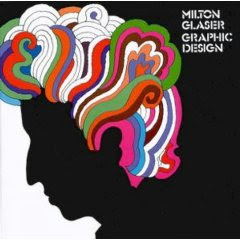
Milton Glaser (born June 261929) is a graphic designer, best known for the I Love New York logo, his "Bob Dylan" poster, the "DC bullet" logo used by DC Comics from 1977 to 2005, and the "Brooklyn Brewery" logo. 
He also founded New York Magazine with Clay Felker in 1968.

Glaser was educated at New York City's High School of Music & Art, graduated from the Cooper Union in 1951 and later, via a Fulbright Scholarship, the Academy of Fine Arts in Bologna under Giorgio Morandi.

In 1954 Glaser was a founder, and president, of Push Pin Studios formed with several of his Cooper Union classmates. 

Glaser's work is characterized by directness, simplicity and originality. He uses any medium or style to solve the problem at hand. His style ranges wildly from primitive to avant garde in his countless book jackets, album covers, advertisements and direct mail pieces and magazine illustrations.He started his own studio, Milton Glaser, Inc, in 1974. This led to his involvement with an increasingly wide diversity of projects, ranging from the design of New York Magazine, of which he was a co-founder, to a 600 foot mural for the Federal Office Building in Indianapolis.


Throughout his career he has had a major impact on contemporary illustration and design. 

His work has won numerous awards from Art Directors Clubs, the American Institute of Graphic Arts, the Society of Illustrators and the Type Directors Club. In 1979 he was made Honorary Fellow of the Royal Society of Arts and his work is included in the Museum of Modern Art, the Victoria and Albert Museum, the Israel Museum and the Musee de l'affiche in Paris. Glaser has taught at both the School of Visual Arts and at Cooper Union in New York City. He is a member of Alliance Graphique International (AGI).

I find that i like Glaser's work even more because i heard him speak about life. I love his attitude about getting old. He thinks that its important to always appreciate the new and he knows that he probably has lasted as long as he has in the industry because he always finds himself interested and intrigued by new ideas, he says that there is constantly something new to learn and that is what makes design so wonderful. You can never finish learning. The man is eighty years old! 


He is amazing. I'm so glad to have seen his interview. He makes me think more open about graphic design and makes me realise that only you are the only person who can limit yourself.


http://en.wikipedia.org/wiki/Milton_Glaser
David Carson i think has great ideas and i like the way he has set out his work to make it look like his expression of what the brief was and turned it in to a story of pictures and words his work stands out and he has taken something that is plane and made it interesting and i believe that will draw the attention of many people. i am very inspired from this graphic designer and want to try something of my own in this way but with a more type of out there type and pictures to it mabey something that dosent make any sence and has a feel of lost to it but the end path is clear alot of the feelings u get from his work is surfing witch is good he seems like the surfy type
                    www.davidcarsondesign.com


Oriel - James Victore


It is the idea of "selling socks" that interests me the least about graphic design.  It is, therefore, refreshing to hear James' words that this is not so.  That infact, graphic design is a socio-political tool.
I like the description given of him by Sean Adams:
He is an unrepentant communicator and activist. His work is strong, humorous, and unforgiving. This courage is rare in a time when alternative points of view are positioned as “unpatriotic.”
James says, "Humans are curious and interesting and diverse, yet we tend to call them a “market.” I think that’s not only atrocious, it’s just rude. I want to be a storyteller, I try to envision more of a one-on-one scenario with a viewer and my work. ... How can I make my work a gift to them? "

On his typical day, James says, "My favorite part of the day is 5 a.m. I wake early to read and study. This is my time to “sharpen the saw.” I don’t know enough about philosophy or economics or even myself, so I read and study these things. I try to turn my weaknesses into strengths."  
I like this statement; it shows that despite being a high profile designer, he recognizes there is always more to learn.